
Monday, November 29, 2010
Christian Dior Runway - Spring Summer 2011
{The Spring-Summer 2011 Runway Fashion Show of Christian Dior. I saw it some time ago, but I still remember it. It was because of the first model, who walked so energetically that I didn't even notice the clothes she's wearing! Just proves how our behaviour/movement can mean so much more than the clothes we wear.}
Friday, November 26, 2010
Words that Burn ♥ 4
 |
| emdot |
To send light into the darkness of men's hearts - such is the duty of the artist.
-- Schumann
{Exams are over finally!}
Monday, November 15, 2010
Beautifully Designed Games - Orisinal


These are screenshots of the beautiful games designed by Ferry Halim. Click here to play.
{I'm in the midst of countless final exams, so I will not be updating so often in the next couple of weeks.}
Thursday, November 11, 2010
René Gruau: Illustrating Dior


{René Gruau and the Line of Beauty is at Somerset House from 10 November until 9 January 2011,somersethouse.org.uk}
source: The Independent
Tuesday, November 9, 2010
Jalouse Says, “Viva Marloes!”


{I've saved these for quite a while now, they're stunning! A combination of beauty, sexiness and femininity.}
source: Fashionista
Monday, November 8, 2010
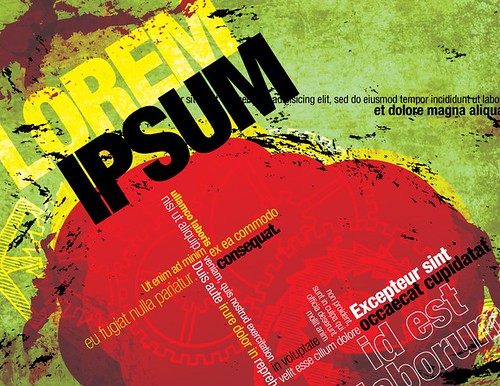
Lorem Ipsum
 |
| pkwahme |
It is a placeholder text used in publishing and graphic design. Which means instead of the original text, lorem ipsum is used. The purpose is to avoid distraction when the reader examines the design, so it basically says, "there's supposed to be writing/content here". Also, it helps the designer to decide on the font type, colour, layout etc.
(And yes, it is Latin.)
Here's a brief background if you're interested:
Lorem Ipsum is derived from sections 1.10.32 and 1.10.33 of "de Finibus Bonorum et Malorum" (On the Ends of Good and Evil) by Cicero. It is altered from the original text so that it doesn't make any sense. (Again, to avoid distraction). Dolorem means pain, while Ipsum means itself.
Lorem Ipsum is derived from sections 1.10.32 and 1.10.33 of "de Finibus Bonorum et Malorum" (On the Ends of Good and Evil) by Cicero. It is altered from the original text so that it doesn't make any sense. (Again, to avoid distraction). Dolorem means pain, while Ipsum means itself.
There are many variations of Lorem Ipsum, but you can generate some yourself here to use in your design layout.
Sunday, November 7, 2010
Unique & Beautiful Umbrellas
 |
| Chinese parasol and base |
 |
| Birds and Maple Leaves 33 Inch Rice Paper Parasol |
 |
| Parasol |
 |
| Long heart print frill edge walker umbrella |
 |
| Sky Umbrella |
 |
| Raindrops on Railways Umbrella |
 |
| Cream lace edge umbrella |
 |
| Silver Top with Silver Lotus Flower Canopy & Black Border |
 |
Felix Rey "Rain Rain Go Away" Clear Bubble Umbrella |
{A collection of uncommon umbrellas I gathered. My favorite's the last one, what's yours?}
Friday, November 5, 2010
Words that Burn ♥ 3
 |
| Esparta |
-- Scott Adams
{note: the above image has not been edited at all!}
Thursday, November 4, 2010
The Secret of Making Beautiful Polyvore Sets in 10 minutes
 |
| Mindstorm by me |
Some Polyvore members update their showcase everyday. They manage to make at least one set each day and their sets are well-known and loved.
What is their secret? Maybe they have no life, and live on Polyvore? Maybe they're geniuses? Maybe... No, no, not really. (well, not for most people..)
But then, how can they make their sets so quickly and so gorgeously at the same time? The answer is actually really simple -
they don't.
Someone told me once, "One minute's performance on the stage takes ten years." In other words, to be who you are today, to do everything you did today, took not only this day, but the your whole life. Making Polyvore sets and designing are just the same. If you collect the little things over time, you'll soon find yourself making great things in a 'little' time.
So what things can you collect?
When looking for items for the set you are making, be mindful of the other items. You may not need them now, you just might need them in the future. Put together a collection of items which you like, and look through them each time before you make a new set. Often I find that items that appeal to me have the same style and can fit together well. So I can simply put the items together and voilà - a set worth admiring! It is also extremely useful to save items from other people's sets and collections, that way, you can see how others used the item. However, never copy other's ideas/sets.
2. Find inspiration from others
I am always inspired and amazed when browsing through others' sets and collections. Try it and you'll feel ideas crowding in your mind.
3. 'Save as Draft'
You don't always have to finish everything at once. In fact, your work will often be refined through the test of time. If you save your set as a draft and return to it some time later, you will see your work in a different perspective, in the perspective of other people. You'll see flaws in your sets easily, and of course, you'll change them and perfect your sets.
4. Know the basic colour rules
Designing Polyvore sets is exactly like designing anything else. And the use of colours is a GREAT and important aspect of designing. Knowing how to use colours effectively will make a big difference to your sets.
The next time you make a set, think of these tips and you'll have a beautiful set in no time (literally)!
Wednesday, November 3, 2010
How to Dry Brush
 |
| freeparking |

Drybrush is a painting technique in which a paint brush that is relatively dry, but still holds paint, is used. Load is applied to a dry support such as paper or primed canvas. The resulting brush strokes have a characteristic scratchy look that lacks the smooth appearance thatwashes or blended paint commonly has.
- Squeeze brush dry
- Load brush with thick paint
- Apply paint to a dry surface
Source: Wikipedia
Tuesday, November 2, 2010
How to Design With Only One Picture
How many pictures did you use the last time you designed something? I'm guessing your answer is mostly likely to be... more than one.
When we design, we normally like to have as much resources as possible, whether it be images or text, so we can choose the best ones to incorporate into the design.
But what if you were only given one image? What if you were in a hurry and could only find one image?
Here are two quick methods that will save you both time and brain battery designing a professional-looking design.
1. Split the picture
Yes, you only have one picture to use, But there's no law against splitting the image, is there? In fact, splitting the image will make your design more harmonious and consistent, as the colours will all be compatible. And consequently, you will have an easier time choosing your colour palette. Let me show you the effects.

It is very effective as long the image and the text contrast. So the image has to have an area where the colour(s) are similar, so the text will be clear and can be read easily.
And... that's it!
Do you have any tips for designing with only one image as well? If so, please share!~
When we design, we normally like to have as much resources as possible, whether it be images or text, so we can choose the best ones to incorporate into the design.
But what if you were only given one image? What if you were in a hurry and could only find one image?
Here are two quick methods that will save you both time and brain battery designing a professional-looking design.
1. Split the picture
Yes, you only have one picture to use, But there's no law against splitting the image, is there? In fact, splitting the image will make your design more harmonious and consistent, as the colours will all be compatible. And consequently, you will have an easier time choosing your colour palette. Let me show you the effects.
 |
| orange tuesday |
Original Image

Split images
It's not perfect, but you get the idea. The split images don't have to be stacked on one side. They can be placed in text, etc. as well.
2. Use as background
Using a image as the background can often be seen in magazines. E.g.
 |
| jurvetson |
 |
| Jennifer Su |
And... that's it!
Do you have any tips for designing with only one image as well? If so, please share!~
Monday, November 1, 2010
Words that Burn ♥ 2
 |
| Ana Patrícia Almeida |
-- Shakespeare
{Found this quote on the door of one of the classrooms, and I instantly understood why Shakespeare's works are around and studied even today. It gave me a passion for literature I thought I'd never have.}
Subscribe to:
Posts (Atom)