
Wednesday, December 22, 2010
New blog
Writing this blog has made me aware of my preferences. So I'm planning and working on another blog which will merge with this one and define its contents better. :)
Tuesday, December 7, 2010
A fun typography lesson

Via: VPS
{The evolution of typography. This colourful design about typography makes learning fun. Check it out!}
It's the holidays! I will be away for 10 days.
Saturday, December 4, 2010
Winners for Anything Beautiful
Here are the winners for the contest, 'Anything Beautiful' on Polyvore:
{For the participants:
Thank you so much for your entries! I loved the variety of the sets you submitted!
It was the hardest job choosing the winners! The sets were all so wonderful.
Thank you for participating.}
It was the hardest job choosing the winners! The sets were all so wonderful.
Thank you for participating.}
Monday, November 29, 2010
Christian Dior Runway - Spring Summer 2011
{The Spring-Summer 2011 Runway Fashion Show of Christian Dior. I saw it some time ago, but I still remember it. It was because of the first model, who walked so energetically that I didn't even notice the clothes she's wearing! Just proves how our behaviour/movement can mean so much more than the clothes we wear.}
Friday, November 26, 2010
Words that Burn ♥ 4
 |
| emdot |
To send light into the darkness of men's hearts - such is the duty of the artist.
-- Schumann
{Exams are over finally!}
Monday, November 15, 2010
Beautifully Designed Games - Orisinal


These are screenshots of the beautiful games designed by Ferry Halim. Click here to play.
{I'm in the midst of countless final exams, so I will not be updating so often in the next couple of weeks.}
Thursday, November 11, 2010
René Gruau: Illustrating Dior


{René Gruau and the Line of Beauty is at Somerset House from 10 November until 9 January 2011,somersethouse.org.uk}
source: The Independent
Tuesday, November 9, 2010
Jalouse Says, “Viva Marloes!”


{I've saved these for quite a while now, they're stunning! A combination of beauty, sexiness and femininity.}
source: Fashionista
Monday, November 8, 2010
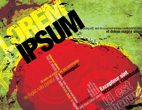
Lorem Ipsum
 |
| pkwahme |
It is a placeholder text used in publishing and graphic design. Which means instead of the original text, lorem ipsum is used. The purpose is to avoid distraction when the reader examines the design, so it basically says, "there's supposed to be writing/content here". Also, it helps the designer to decide on the font type, colour, layout etc.
(And yes, it is Latin.)
Here's a brief background if you're interested:
Lorem Ipsum is derived from sections 1.10.32 and 1.10.33 of "de Finibus Bonorum et Malorum" (On the Ends of Good and Evil) by Cicero. It is altered from the original text so that it doesn't make any sense. (Again, to avoid distraction). Dolorem means pain, while Ipsum means itself.
Lorem Ipsum is derived from sections 1.10.32 and 1.10.33 of "de Finibus Bonorum et Malorum" (On the Ends of Good and Evil) by Cicero. It is altered from the original text so that it doesn't make any sense. (Again, to avoid distraction). Dolorem means pain, while Ipsum means itself.
There are many variations of Lorem Ipsum, but you can generate some yourself here to use in your design layout.
Sunday, November 7, 2010
Unique & Beautiful Umbrellas
 |
| Chinese parasol and base |
 |
| Birds and Maple Leaves 33 Inch Rice Paper Parasol |
 |
| Parasol |
 |
| Long heart print frill edge walker umbrella |
 |
| Sky Umbrella |
 |
| Raindrops on Railways Umbrella |
 |
| Cream lace edge umbrella |
 |
| Silver Top with Silver Lotus Flower Canopy & Black Border |
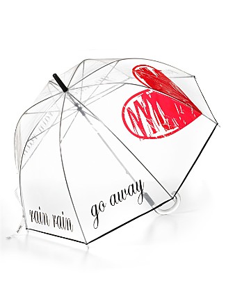 |
Felix Rey "Rain Rain Go Away" Clear Bubble Umbrella |
{A collection of uncommon umbrellas I gathered. My favorite's the last one, what's yours?}
Friday, November 5, 2010
Words that Burn ♥ 3
 |
| Esparta |
-- Scott Adams
{note: the above image has not been edited at all!}
Thursday, November 4, 2010
The Secret of Making Beautiful Polyvore Sets in 10 minutes
 |
| Mindstorm by me |
Some Polyvore members update their showcase everyday. They manage to make at least one set each day and their sets are well-known and loved.
What is their secret? Maybe they have no life, and live on Polyvore? Maybe they're geniuses? Maybe... No, no, not really. (well, not for most people..)
But then, how can they make their sets so quickly and so gorgeously at the same time? The answer is actually really simple -
they don't.
Someone told me once, "One minute's performance on the stage takes ten years." In other words, to be who you are today, to do everything you did today, took not only this day, but the your whole life. Making Polyvore sets and designing are just the same. If you collect the little things over time, you'll soon find yourself making great things in a 'little' time.
So what things can you collect?
When looking for items for the set you are making, be mindful of the other items. You may not need them now, you just might need them in the future. Put together a collection of items which you like, and look through them each time before you make a new set. Often I find that items that appeal to me have the same style and can fit together well. So I can simply put the items together and voilà - a set worth admiring! It is also extremely useful to save items from other people's sets and collections, that way, you can see how others used the item. However, never copy other's ideas/sets.
2. Find inspiration from others
I am always inspired and amazed when browsing through others' sets and collections. Try it and you'll feel ideas crowding in your mind.
3. 'Save as Draft'
You don't always have to finish everything at once. In fact, your work will often be refined through the test of time. If you save your set as a draft and return to it some time later, you will see your work in a different perspective, in the perspective of other people. You'll see flaws in your sets easily, and of course, you'll change them and perfect your sets.
4. Know the basic colour rules
Designing Polyvore sets is exactly like designing anything else. And the use of colours is a GREAT and important aspect of designing. Knowing how to use colours effectively will make a big difference to your sets.
The next time you make a set, think of these tips and you'll have a beautiful set in no time (literally)!
Wednesday, November 3, 2010
How to Dry Brush
 |
| freeparking |

Drybrush is a painting technique in which a paint brush that is relatively dry, but still holds paint, is used. Load is applied to a dry support such as paper or primed canvas. The resulting brush strokes have a characteristic scratchy look that lacks the smooth appearance thatwashes or blended paint commonly has.
- Squeeze brush dry
- Load brush with thick paint
- Apply paint to a dry surface
Source: Wikipedia
Tuesday, November 2, 2010
How to Design With Only One Picture
How many pictures did you use the last time you designed something? I'm guessing your answer is mostly likely to be... more than one.
When we design, we normally like to have as much resources as possible, whether it be images or text, so we can choose the best ones to incorporate into the design.
But what if you were only given one image? What if you were in a hurry and could only find one image?
Here are two quick methods that will save you both time and brain battery designing a professional-looking design.
1. Split the picture
Yes, you only have one picture to use, But there's no law against splitting the image, is there? In fact, splitting the image will make your design more harmonious and consistent, as the colours will all be compatible. And consequently, you will have an easier time choosing your colour palette. Let me show you the effects.

It is very effective as long the image and the text contrast. So the image has to have an area where the colour(s) are similar, so the text will be clear and can be read easily.
And... that's it!
Do you have any tips for designing with only one image as well? If so, please share!~
When we design, we normally like to have as much resources as possible, whether it be images or text, so we can choose the best ones to incorporate into the design.
But what if you were only given one image? What if you were in a hurry and could only find one image?
Here are two quick methods that will save you both time and brain battery designing a professional-looking design.
1. Split the picture
Yes, you only have one picture to use, But there's no law against splitting the image, is there? In fact, splitting the image will make your design more harmonious and consistent, as the colours will all be compatible. And consequently, you will have an easier time choosing your colour palette. Let me show you the effects.
 |
| orange tuesday |
Original Image

Split images
It's not perfect, but you get the idea. The split images don't have to be stacked on one side. They can be placed in text, etc. as well.
2. Use as background
Using a image as the background can often be seen in magazines. E.g.
 |
| jurvetson |
 |
| Jennifer Su |
And... that's it!
Do you have any tips for designing with only one image as well? If so, please share!~
Monday, November 1, 2010
Words that Burn ♥ 2
 |
| Ana Patrícia Almeida |
-- Shakespeare
{Found this quote on the door of one of the classrooms, and I instantly understood why Shakespeare's works are around and studied even today. It gave me a passion for literature I thought I'd never have.}
Sunday, October 31, 2010
Periodic Table of Typefaces

Saturday, October 30, 2010
By Fryd - interiors
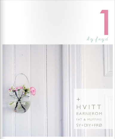
Re-blogged from Graphic-ExchanGE | By Fryd
I absolutely love this! Here are some of my favourites.
Using pink and blue pastels, the design is simple and elegant. The use of white space/borders enhances the design.
Internet Capped!
Haven't updated in two days and I'm already feeling guilty. My internet's completely capped and I haven't been able to open many web pages. But I'll be fully back on Tuesday next week, I promise. :)
Meanwhile, I'll try and re-blog some inspirational pics/articles.
Meanwhile, I'll try and re-blog some inspirational pics/articles.
Wednesday, October 27, 2010
How to Print Professional Looking Designs at Home
 |
| briansuda |
"No bleed? What's no bleed?!", you ask.
It's simply a posh word for "with margins".
I'm sure you've all experienced the discontent and frustration when the poster/brochure/etc. which you've spent your whole lives on came out to have around it... A FAT, WHITE MARGIN!!! It completely ruins the design and most importantly, it makes it look unprofessional and amateurish.
So should you leave it there? Should you cut it out? You stand there undecided and troubled.
Don't fuss! There is a solution!
First, allow me take you through the logic:
There are only two factors that can be changed: the printer, or, your design.
The printer: unless you pay to get your design printed, there's no way you can get your little printer to print bleed.
Your design: but can it be changed to make the page look like it's a bleed?
Yes!
How?
Scroll down.
Un-connect the dots
We see a margin because our eyes connect the elements on the page to form a line, because those elements are aligned so perfectly that they do actually form an invisible line. And getting rid of the invisible line means getting rid of the margins.
Rearrange your elements
This can be done easily by drawing a margin line smaller than your printer's and evading and crossing over that line by rearranging the elements on the page. This may make your page look a bit messy, so it's best to use in casual, informal designs.
Minimize your elements
Instead of using a background-filling image, minimize the image. Same with texts. Your design will then achieve a minimalist effect. This works with serious designs as well. Below is an example.
 |
| OliBac |
How about you? Do you have any tricks for printing no-bleed?
Tuesday, October 26, 2010
Words that Burn ♥ 1

A wise girl kisses but doesn't love, listens but doesn't believe, and leaves before she is left.
-- Marilyn Monroe
{The art of living, really. A bit pessimistic, but all arts are, aren't they?}
Monday, October 25, 2010
10 Tips to Thrive on Polyvore
 |
| Morning of the Ball by me (Won 1st place in contest 'Dresses for the Ball') |
For those of you who don't know already, Polyvore is a website on which you can design sets, mostly of fashion. The sets are basically like collages. It's a good place to sharpen up your design skills and get inspiration from others. Click here to check it out.
- Be yourself. Design sets that are "you". Never do it just because that type of sets is popular. I've always believed that if your heart's not in it, it's simply not going to work.
- Don't be shy. Remain active in the community by adding and commenting on other's sets. And when others add you as a contact, make sure you add them back.
- Create regularly. Create new sets constantly, that way, you'll improve your design skills and gain more "likes". Practice makes perfect!
- Be creative. Try out different styles of clothes or design layouts, this will help you to find your strengths and weaknesses.
- Join contests. Contests are fun and they motivate you to keep creating in case you get the "designer's block". Also, if you win one, well, then, it's all about the publicity isn't it?
- Absorb. It's always worthwhile to explore others' sets and collections for inspiration and techniques. But..
- Never steal. Being inspired is OK, but copying is not.
- Be helpful. Go to the Ask section and answer some questions, you'll get a best answer icon on your profile if your answer was voted as the best, and if not, you'll always feel good for your act of kindness. But please don't do it to promote your sets, which doesn't really work and is annoying. Instead, put yourself in the askers' position and think, "what would I really do?"
- Don't over-do it. Never go around advertising your sets in comments or adding contacts whose profiles you haven't even seen. This won't make you extremely popular.
- Be patient. It's OK if you don't win a contest the first time you enter, or the second, or the tenth... Just remember, eventually you'll have a crowd of friends who will admire your style, whatever it may be!
I hope this helped! Do you have any experience you'd like to share?
Sunday, October 24, 2010
How to Choose the Perfect Colours for Your Design - Part 2
In the first part of the article, 'How to Choose the Perfect Colours for Your Design', I talked about importance of choosing the right colours for your design and the "Use what you have" rule. In this part I will focus on how to create a harmonizing palette from the colour(s) you picked.
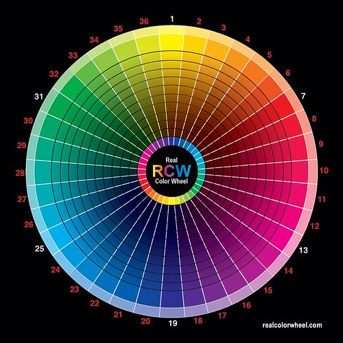
There are many different colour combinations possible, but the ones I will introduce to you are some of the basic and the most "scientific" ones. What do I mean by "scientific"? Well, it's the most logical and ... you'll see. :)
Now let's bring on the colour wheel.
Monochromatic
You can probably guess from its name. This is basically a palette consisting of just one single colour, but in different tones: dark, medium and light.
Analogous
This is a palette with colours chosen from either side of your base colour on the colour wheel. For example, if your original colour belongs to group 3, then your palette would contain colours from group 2 and 4. This kind of palette is easy to work with but does not have a lot of contrast.
Complement
The complement colour is the colour on the opposite side of your base colour on the wheel. So the complement of the colours in group 19 would be group 1 colours. These bring exciting contrast!
Split complement
This is your base colour plus the colours analogous to your complement colour. It's a bit confusing, but here's an example: if your base colour is in group 1, then a split complement palette would consist of colours from group 1, 18 and 20.
Variations
Other combinations can be created by adding the above types of combinations together. E.g. Adding a complement and a analogous palette together would create one with colours from 3 groups side by side and the group directly opposite of the base colour group. Let's say your base colour is in group 1, a complement+analogous palette would be comprised of colours from group 36,1,2 and 19.
Hopefully, this two-part article has helped you in designing. Try it today and you'll get amazing results!
There are many different colour combinations possible, but the ones I will introduce to you are some of the basic and the most "scientific" ones. What do I mean by "scientific"? Well, it's the most logical and ... you'll see. :)
Now let's bring on the colour wheel.
 |
| unleashingmephotography |
Monochromatic
You can probably guess from its name. This is basically a palette consisting of just one single colour, but in different tones: dark, medium and light.
Analogous
This is a palette with colours chosen from either side of your base colour on the colour wheel. For example, if your original colour belongs to group 3, then your palette would contain colours from group 2 and 4. This kind of palette is easy to work with but does not have a lot of contrast.
Complement
The complement colour is the colour on the opposite side of your base colour on the wheel. So the complement of the colours in group 19 would be group 1 colours. These bring exciting contrast!
Split complement
This is your base colour plus the colours analogous to your complement colour. It's a bit confusing, but here's an example: if your base colour is in group 1, then a split complement palette would consist of colours from group 1, 18 and 20.
Variations
Other combinations can be created by adding the above types of combinations together. E.g. Adding a complement and a analogous palette together would create one with colours from 3 groups side by side and the group directly opposite of the base colour group. Let's say your base colour is in group 1, a complement+analogous palette would be comprised of colours from group 36,1,2 and 19.
Hopefully, this two-part article has helped you in designing. Try it today and you'll get amazing results!
Floating Stairs
 |
| Cubeme |
I think it's really, really creative, but also a bit scary...
Saturday, October 23, 2010
How to Choose the Perfect Colours for Your Design - Part 1
 |
| Team Dalog |
In the last post I talked about how to balance the position of images and texts. (click here to read). This post is going to be about the balance of colours and how to choose the perfect colours for your designs.
Choosing the right colours for your design is extremely important, as it can set the mood of your design and make it effective. But it can often be exhausting and difficult to choose the perfect colour combination, especially when there are millions of colours available today. So how can we choose quickly and efficiently?
Use What You Have
This tip has worked wonders for me ever since I learned about it. So what’s it all about? It’s simple. Always use colours from the images you use for your design. For example, you want to use this picture of the tulips for your design.
 |
| Kıvanç Niş |
All you need to do is Filter-Blur-Pixelize (I use GIMP, which is free to download. It’s still possible if you use other programs) the photo so that there are less colours.
Then just choose some colours (preferably the ones occurring the most) from the photo and you’re done! An advantage of this is that you’ll always have colours that match your photo and consequently, your design!
The next part will deal with creating a successful colour palette.
Subscribe to:
Posts (Atom)