Showing posts with label Design. Show all posts

Tuesday, November 2, 2010

How to Design With Only One Picture

How many pictures did you use the last time you designed something? I'm guessing your answer is mostly likely to be... more than one.

When we design, we normally like to have as much resources as possible, whether it be images or text, so we can choose the best ones to incorporate into the design.

But what if you were only given one image? What if you were in a hurry and could only find one image?

Here are two quick methods that will save you both time and brain battery designing a professional-looking design.


1. Split the picture

Yes, you only have one picture to use, But there's no law against splitting the image, is there? In fact, splitting the image will make your design more harmonious and consistent, as the colours will all be compatible. And consequently, you will have an easier time choosing your colour palette. Let me show you the effects.


orange tuesday
Original Image

Split images

It's not perfect, but you get the idea. The split images don't have to be stacked on one side. They can be placed in text, etc. as well.


2. Use as background

Using a image as the background can often be seen in magazines. E.g.


jurvetson
Jennifer Su
It is very effective as long the image and the text contrast. So the image has to have an area where the colour(s) are similar, so the text will be clear and can be read easily.

And... that's it!
Do you have any tips for designing with only one image as well? If so, please share!~

Wednesday, October 27, 2010

How to Print Professional Looking Designs at Home

briansuda
Unless you're a professional designer/artist with a super fancy studio, you're most likely to have one of those small printers that print A4 size pages only. And those printers can only print no bleed.

"No bleed? What's no bleed?!", you ask.
It's simply a posh word for "with margins".

I'm sure you've all experienced the discontent and frustration when the poster/brochure/etc. which you've spent your whole lives on came out to have around it... A FAT, WHITE MARGIN!!! It completely ruins the design and most importantly, it makes it look unprofessional and amateurish.

So should you leave it there? Should you cut it out? You stand there undecided and troubled.

Don't fuss! There is a solution!

First, allow me take you through the logic:
There are only two factors that can be changed: the printer, or, your design.
The printer: unless you pay to get your design printed, there's no way you can get your little printer to print bleed.
Your design: but can it be changed to make the page look like it's a bleed?

Yes!
How?
Scroll down.


Un-connect the dots

We see a margin because our eyes connect the elements on the page to form a line, because those elements are aligned so perfectly that they do actually form an invisible line. And getting rid of the invisible line means getting rid of the margins.

Rearrange your elements
This can be done easily by drawing a margin line smaller than your printer's and evading and crossing over that line by rearranging the elements on the page. This may make your page look a bit messy, so it's best to use in casual, informal designs.

Minimize your elements
Instead of using a background-filling image, minimize the image. Same with texts. Your design will then achieve a minimalist effect. This works with serious designs as well. Below is an example.

OliBac

Instead of paying for full-bleed printing, here are two tricks to eliminate the margin created by our eyes and produce professional looking designs. I think it's always better to work with what you've got rather than fight it and trying to get rid of it.

How about you? Do you have any tricks for printing no-bleed?

Sunday, October 24, 2010

How to Choose the Perfect Colours for Your Design - Part 2

In the first part of the article, 'How to Choose the Perfect Colours for Your Design', I talked about importance of choosing the right colours for your design and the "Use what you have" rule. In this part I will focus on how to create a harmonizing palette from the colour(s) you picked.

There are many different colour combinations possible, but the ones I will introduce to you are some of the basic and the most "scientific" ones. What do I mean by "scientific"? Well, it's the most logical and ... you'll see.  :)

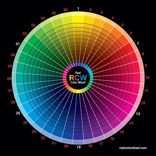
Now let's bring on the colour wheel.

unleashingmephotography

Monochromatic
You can probably guess from its name. This is basically a palette consisting of just one single colour, but in different tones: dark, medium and light.

Analogous
This is a palette with colours chosen from either side of your base colour on the colour wheel. For example, if your original colour belongs to group 3, then your palette would contain colours from group 2 and 4. This kind of palette is easy to work with but does not have a lot of contrast.

Complement
The complement colour is the colour on the opposite side of your base colour on the wheel. So the complement of the colours in group 19 would be group 1 colours. These bring exciting contrast!

Split complement
This is your base colour plus the colours analogous to your complement colour. It's a bit confusing, but here's an example: if your base colour is in group 1, then a split complement palette would consist of colours from group 1, 18 and 20.

Variations
Other combinations can be created by adding the above types of combinations together. E.g. Adding a complement and a analogous palette together would create one with colours from 3 groups side by side and the group directly opposite of the base colour group. Let's say your base colour is in group 1, a complement+analogous palette would be comprised of colours from group 36,1,2 and 19.


Hopefully, this two-part article has helped you in designing. Try it today and you'll get amazing results!

Saturday, October 23, 2010

How to Choose the Perfect Colours for Your Design - Part 1

Team Dalog

In the last post I talked about how to balance the position of images and texts. (click here to read). This post is going to be about the balance of colours and how to choose the perfect colours for your designs.

Choosing the right colours for your design is extremely important, as it can set the mood of your design and make it effective. But it can often be exhausting and difficult to choose the perfect colour combination, especially when there are millions of colours available today. So how can we choose quickly and efficiently?


Use What You Have

This tip has worked wonders for me ever since I learned about it. So what’s it all about? It’s simple. Always use colours from the images you use for your design. For example, you want to use this picture of the tulips for your design.

Kıvanç Niş

All you need to do is Filter-Blur-Pixelize (I use GIMP, which is free to download. It’s still possible if you use other programs) the photo so that there are less colours.


Then just choose some colours (preferably the ones occurring the most) from the photo and you’re done! An advantage of this is that you’ll always have colours that match your photo and consequently, your design!

The next part will deal with creating a successful colour palette.

Wednesday, October 20, 2010

How to Balance Your Design

Balance is a part of life. Throughout history, men (and women) have tried to figure out the golden rule of balance that’s present in every part of our world, which joins up this magnificent world.

Balance exists not only in the position of objects, but also in the choice of colours, the size of objects etc.

In Jane Eyre, Miss Eyre tells young Adèle that “Remember, the shadows are just as important as the light.” It’s true. Can you imagine a world without darkness? Without darkness, light wouldn’t shine.

Balance, therefore, is crucial to any good design. You may have the greatest and most original ideas, but without balance, your design is just not going to work. So how do we attain balance? How do we know when we have attained the right balance?

As I mentioned before, balance is needed in all the elements of a good design: position, colours, size etc. But for now, we’re just going to focus on position, which is the placement of your images and texts.


Perfect Symmetry

Symmetrical balance is when the two sides of a canvas have equal weights. The two sides maybe be left and right, or up and down. This can be achieved easily by centering the object (image or text). Also it can be achieved by mirroring the object on one side, so that the two sides feel equal. From my experience, this can usually make the design look more formal and grand.
Examples: Remember your maths geometry lessons? The patterns you drew are the best examples of symmetrical designs.
Caution: this may also make the design look flat and consequently, boring.


“Imperfection”

Many modern designs are not actually “mathematically” balanced. They may be uneven, off-centred and irregular. But somehow, they just feel… right. Some asymmetrical designs may use space and sizes to make the design feel steady, but others are simply not balanced at all, yet they all communicate messages effectively and are pleasant to look at. Using asymmetrical or discordant balance in designs is harder than using symmetrical balance and requires you to “feel”  instead of just measuring. A useful rule is never put an object in the very centre while using asymmetrical balance.
Examples: 
Felipe Skroski

C Lemons

Caution: if not used properly, the designs may look, well… un-designed.


There we are, the two basic ways of balancing objects. But after all, the ultimate goal is to make the design feel “right”. How do we know? Well, there should be a prickly feeling somewhere in you that tells you when your design isn’t so balanced. And if you really don’t know, you can always ask a friend, as other people are usually better at seeing the little flaws in your design.

So what do you think? Do you have any tips for balancing designs?
Related Posts Plugin for WordPress, Blogger...